The Seamless Access call to action can be presented as a static or dynamic component or “button”* made up of the following basic elements:
Background

Icon
Stroke
Text

Text and institution name
(dynamic button only)Add or change institution link
(dynamic button only)
Reusable Assets
SVG files can be colored and scaled in your code, or edited directly in any vector-based design app like Adobe Illustrator or layout apps like Adobe XD or Sketch.
CSS CDN:
https://service.seamlessaccess.org/sa-button.css
Seamless Access icon


Edit/change icon

Note that although the call to action is often described as a button, it is technically a styled link and is not created using a UI button component.
Static Button Specifications (Limited)
The limited implementation may use a static button presentation to link to the SeamlessAccess central IdP Discovery service. Specifications and HTML to create the button are provided below.
Button
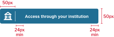
Icon (same specs for all versions): 28px high (Centered in first 50 px of button)
Vertical stroke: 32px high, 1px weight
Single line of text: Arial bold, 14px
(Sentence case)Corner radius: 5px
Minimum width: 256px
Maximum width: 328px
Margins on either side of the text inside the button, should be not less than 24px which includes 30 character spaces plus the ellipsis.
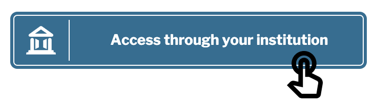
Hover & Focus State
Blur: 8
Y-axis: 4
Shadow opacity: 37
Color: #000000
Mark-up for static button
HTML
| Code Block |
|---|
<!-- Markup for the button. -->

<div class="d-flex sa-button" role="button">
  <div class="sa-button-logo-wrap">
    <img src="https://service.seamlessaccess.org/sa-white.svg" class="sa-button-logo" alt="Seamless Access Logo"/>
  </div>
  <div class="d-flex justify-content-center align-items-center sa-button-text text-truncate">
    <div class="sa-button-text-primary text-truncate">Access through your institution</div>
  </div>
</div>

<!-- Markup for the "Add or change institution" link. -->

<div class="sa-access-text text-truncate">
  <i class="sa-cta-plus"><img src="https://service.seamlessaccess.org/sa-pen.svg" alt="Edit Icon"/></i>
  <div class="sa-cta-access"><span>Add or Change Institution</span></div>
</div> |
CSS
| Code Block |
|---|
// Flexbox properties that keep button text centered horizontally and vertically.

.d-flex {
  display: flex;
}

.align-items-center {
  align-items: center;
}

.justify-content-center {
  justify-content: center;
}

// Text truncation that keeps the button fully responsive.

.text-truncate {
  overflow: hidden;
  text-overflow: ellipsis;
  white-space: nowrap;
}

// Button styling that utilizes Libre Franlin Google Font.

.sa-button, .sa-access-text {
  font-family: Arial, sans-serif;
  line-height: 1.4;
}

.sa-button {
  cursor: pointer;
  background-color: var(--primary-blue);
  border-radius: 5px;
  padding: 9px;
}

.sa-button-logo-wrap {
  text-align: center;
  width: 50px;
  height: 100%;
  border-right: 1px solid var(--white);
  padding: 5px 5px 5px 0;
}

.sa-button-logo {
  width: 30px;
  vertical-align: middle;
}

.sa-button-text {
  padding-left: 10px;
  text-align: center;
  width: 85%;
  color: var(--white);
}

.sa-button-text-primary {
  font-size: 14px;
  font-weight: 700;
}

// Styling of the "Add or change institution" text under the button.

.sa-access-text {
  cursor: pointer;
  text-align: center;
  width: 100%;
  margin-top: 5px;
  font-size: 13px;
  font-weight: 400;
  line-height: 1.46;
  color: var(--primary-blue);
}

.sa-cta-access, .sa-cta-plus {
  display: inline;
  padding: 0 3px;
}

.sa-cta-plus > img {
  height: 13px
} |
See Limited Implementation for additional implementation guidelines.
Dynamic Button Specifications
There are two ways to implement the dynamic button, through the standard implementation (iframe) or through the advanced implementation (api).
Specifications for the button are provided below. The dynamic button has two states: No remembered institution (sometimes called the “cold state”) and Remembered institution.
Button States
No remembered institution
Single line of text: Arial bold, 14px
(Sentence case)Icon (same specs for all versions): 28px high (Centered in first 50 px of button)
Vertical stroke: 32px high, 1px weight
Corner radius: 5px
Minimum width: 256px
Maximum width: 328px
Remembered institution with add/change link
Two lines of text with button:
First line: Arial Regular, 13px
(Sentence case)Second line: Arial bold, 14px
(Title Case)
Add/change link
Fontawesome icon, SVG file: 24px
Arial regular, 13px
(Sentence case)
| Info |
|---|
For advanced implementers, the Add or change institution link should point to the remembered institution list which lets users:
For more details on the Add or change institution experience, seeDisplaying and Editing Remembered Institutions |
Long institution names
Long names should be truncated to fit the available width of the button or the IdP discovery service results panel. The dynamic button is designed to be responsive to the available display space and additional handling rules will be developed as the service is built out.
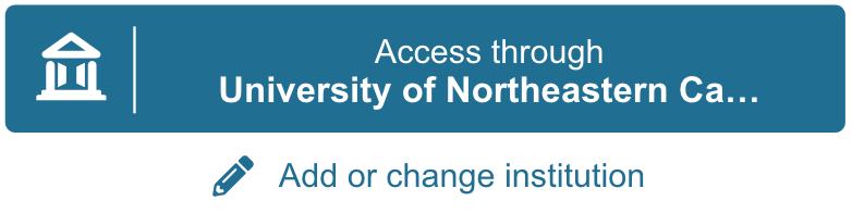
Institution names should truncate after a maximum of 32 characters, including spaces, followed by an ellipsis (…) without a space.
Margins on either side of the text inside the button should be a minimum of 24px, but can be more in the case of short institution names.
The recommended minimum button width is 256px (important for mobile screens). This reduces character count to a maximum of 21 character spaces plus the ellipsis.
Language support
The dynamic button should recognize a language parameter and display appropriate text.
Standard Integration Implementation Considerations
The dynamic button may be added to a webpage by creating an i-frame that calls the button from Seamless Access. See the section on the Standard Implementation for more information.
I-frame
The i-frame is responsive, however our recommendation is to provide space with the following dimensions:
Width: 350px
Height: 85px
Break down of height:
Button Height: 55px
Margin at the bottom of the button: 3px
Link “Add or change institution”: 18px
Margin at the top of the link: 5px
Extra space under the link to allow any overflow from the “pen” icon: 4px
The text inside of the button has built in truncation, therefore the width is flexible (responsive), but our recommended width of 350px assists in avoiding the truncation for most of lengthy institution names.
The Iframe packs the button and the link below without any outside margins or padding, we recommend applying padding around the Iframe of at least 6px, to prevent collision with other elements on a website.
Configurations
Standard button implementation (Java script and HTML)
| Code Block | ||
|---|---|---|
| ||
<script src=“https://use.thiss.io/thiss.js”/>
<div id=“login”> </div>
<script>
    window.onload = function() {
       thiss.DiscoveryComponent({
           loginInitiatorURL: ‘https://localhost/Shibboleth.sso/Login?target=https://google.com’,
       }).render(‘#login’);
    };
</script> |
Color: The standard implementation has a default background and text/icon color, but you may override those default values by injecting parameters into the script, available controls:
backgroundColor - controls the color of the iFrame where the button is rendered
color - controls the color of the button
Example:
The following example will render a green button with white text:
| Code Block |
|---|
<script src=“https://use.thiss.io/thiss.js”/>
<div id=“login”> </div>
<script>
    window.onload = function() {
       thiss.DiscoveryComponent({
           loginInitiatorURL: ‘https://localhost/Shibboleth.sso/Login?target=https://google.com’,
           backgroundColor: '#008000',
           color: '#FFFFFF'
       }).render(‘#login’);
    };
</script> |
Language: The standard dynamic button should recognize a language parameter and display appropriate text.
See additional parameters and configurations required to implement the standard button.
DOs and DON’Ts when implementing the Seamless Access button
Do
| Tip |
|---|
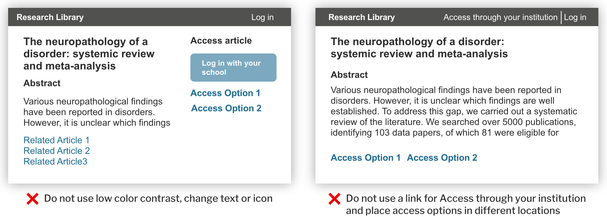
Use a consistent presentation of the “Access through your institution” button. |
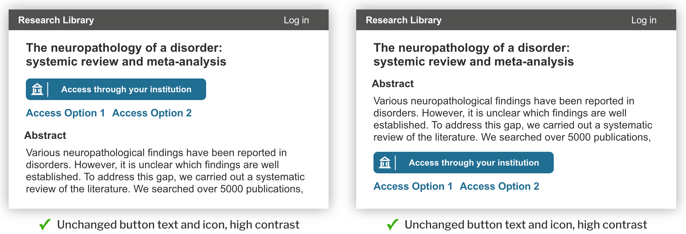
Repetition of the language and visual styling of the access button including icon, text, button, contrast and behavior will significantly reduce friction and build recognition and confidence for users.
Do Not
| Warning |
|---|
Change “Access through your institution” text label. |
| Warning |
|---|
Use low contrast for the text and button background. (See Accessibility guidelines) |
| Warning |
|---|
Show “Access through your institution” as a link when it is the primary call to action for access. |
Note that Seamless Access has not yet taken a position on the color of the button. During the Beta Phase, Service Providers may choose a background color, font and button shape consistent with their primary call to action style definition.
The standard implementation has a default button color, but you may override that default by providing color configuration parameters in the call to the SeamlessAccess Discovery component. See configuring standard button parameters for more information.
Design Rationale
Why use a button?
For most users, institutional access is the best bet for accessing the full text, so the call to action for institutional access needs to be easy to find and easy to choose. In most cases, institutional access should be presented as the primary or preferred path for a user, as opposed to an equivalent option. (It should only be presented as a secondary option if it truly is not the preferred access path.) Alternative presentations of the call to action (versions with an icon and link) were tested and were significantly harder for users to recognize. This design recommendations in this section also follow best practice/ familiar conventions for similar experiences users encounter in everyday digital experiences (e.g., button signaling option to check out with PayPal).
Why have a symbol or icon?
The unique open-door institution symbol aides in quick recognition across different publisher sites. Along with the label, it reinforces the relationship (the institution) that is most likely to gain them access. With that association, the user knows what to expect and can confidently complete the subsequent steps with minimal friction.
Why are words like “log in” or “sign in” not used?
Several versions of the call to action text were tested including “log in through your institution” and “Get full text”. While users generally understood these labels, they also introduced ambiguity or incorrect expectations, because users possess multiple login credentials and they are uncertain which ones are being requested. “Access through your institution” was clear and unambiguous and set expectations that were aligned with what users then experienced once they clicked the button. Seamless Access recommends reserving Log in or Sign in in utility navigation for experiences where the user has a direct account with the Service provider.
The specific labeling and design of the call to action button were informed by best practice models and multiple rounds of iterative user testing.